ZARA — An E-Commerce UX/UI Case Study
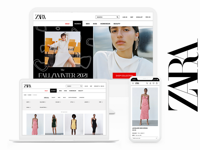
Roles: Product Designer, UX Researcher
Method: Double Diamond Process
Project Duration: 2 weeks
1. Background
What is the E-commerce industry?
E-commerce (otherwise known as electronic commerce) is the process of buying and selling goods and services over the internet. These transactions can be either directly from the business to the consumer (B2C), or business to business (B2B). From buying new outfits, to browsing for trainers — there is no denying that the industry has integrated itself into almost all aspects of our day to day lives, especially in terms the items we purchase to wear.
Fashion is currently the largest business to consumer segment in the market, with its global size estimated to be at around $752.5 billion in 2020 alone. According to a Fashion eCommerce report in 2021, the market is expected to grow even more “at 9.1% per year and reach a total market size of $1.64, 7 billion by the end of 2025.”
How has E-Commerce changed over the past 10 years?
The e-commerce industry has changed dramatically over the last 10 years, largely in part to continually changing consumer habits, and how quickly technology has been evolving. We are now able to make purchases on the move from our smartphones with a tap of the finger, shop within social media apps and in some cases, even try out products with virtual reality before making a purchase.
BigCommerce spoke with leaders in the industry about some of the changes we have been seeing, and compiled a list of trends that could be leading the way in the very near future. The top trends on the list included onsite personalisation — which involves using AI (artificial intelligence) to produce a personalised experience for the user. A great example of this is Amazon AI recommendation engines to recommend new products to the user based on their previous recent purchases. ”By recommending products that might interest individual users, Amazon is able to increase the number of transactions per customer, maximise the value of each customer and turn them into repeat buyers. By 2013, Amazon recommendations were generating 35% of all sales on the eCommerce giant’s platform.”
The shift from retail to online
Recent technological advancements have meant that the shift from retail to online was inevitable. The decline in brick and mortar stores has been evident in the last decade, but has seen a steep decline in the last year alone, largely due to COVID-19. A March 2021 news article reports that more than 17,500 chain store outlets closed in 2020, with COVID spurring an “average daily closure of 48 shops, restaurants and other leisure and hospitality venues.”
All ‘non-essential’ stores were forced to remain closed for the better part of a year, which accelerated changes that were already in motion on the UK high street. This resulted in a shift to online shopping, meaning that they had to turn all of their efforts to online presence and e-commerce in order to still make a profit and reduce losses. Many companies and brands invested in improving their online user experiences.
2. The Brief
What am I going to do?
In this case study, I will be discussing my project, the objectives, and present the following deliverables:
- 3 pages: home page and 2 other pages.
- Mobile and Desktop compatible screens (Responsive)
Alongside this, key insights into each stage of the method I will be using — the Double Diamond Process, and detail my user research and design process. I will be looking at the ZARA eCommerce website across desktop and mobile, where I will go on to identify pain points that customers are facing, and implement design thinking in order to resolve these problems in a way that will meet user needs, but also keeping the business needs and objectives in mind also.
Why is ZARA my chosen company?
ZARA is a popular brand worldwide, especially here in the UK. Over the last year, it has become a go-to brand of mine when looking for new items of clothing, but the same user experience problems have persisted when trying to navigate throughout the site. It has become a deterrent to myself and many others, driving people to either using the ZARA mobile app, shopping in person when possible, or not making purchases from ZARA at all. In having a poor user experience, it is possible that the website could have higher bounce rate (the percentage of visitors who enter the site and then leave rather than continuing to view other pages within the same site), and a lower conversion rate (the percentage of users that take a desired action, ie. completing a purchase) compared to the websites of their competitors. If so, this could be a problem for the business as a whole.
The problem statement
With a focus on website navigation and product browsing, how might we use design thinking to improve the customer experience in order to help fulfil user needs, as well as make sure the website is aligned with their core values — beauty, clarity, functionality and sustainability?
By highlighting the core value of ‘functionality’ and implementing it into the final design solution, business needs can be met.
Looking at ZARA reviews from Trust Pilot (as pictured below), it is clear that navigating the website, and product browsing are some of the main issues that customers are having — two key features of the online shopping experience. If designed poorly, this can quickly drive customers away, which is why it is essential to focus on having a simple and easy to use website.
Jakob’s law states that users spend most of their time on other websites, therefore users want products to feel and work the same as other products they know, as they transfer expectations from one familiar product to another. In the ZARA websites’ desire to stand out and adhere to the beauty aspect of their core goals, some practices that build a good user experience may have been neglected in favour of aesthetics.
3. Hypothesis
What I am going to do/change and a prediction for the outcome of results:
Based on the problems previously outlined, and information I will collect from further research, I plan to improve the way that users are able to navigate the website, and browse products by implementing Jakob’s Law. To do this, I will be focusing on a navigation bar, the layout of the product pages, and the ability to filter your options. After this, I will be testing my ideas and designs with users with a combination of questionnaires and interviews. The outcome I am looking to achieve is a navigation and browsing experience that feels familiar, and works in a similar way to most fashion eCommerce websites in order to provide a smooth user journey. All whilst staying in line with the brand mission by retaining the ‘luxury’ and ‘high fashion’ feel that the website has to it.
4. Business Research
Background information on your chosen company
In order to gain a better understanding of Zara as a business, it was important to carry out some background research into the company to help provide some context to their business needs.
About Zara
- They are a Spanish owned clothing retailer, with their first store opening in the Spanish coastal city of A Coruña.
- They are a company specialising in fast fashion, selling products such as clothing and accessories, shoes, swimwear, and finally, beauty and perfumes.
- They belong to and are the largest company in the Spanish owned group Inditex, along with their sister company Zara Home which specialises in retailing houseware and home textile pieces. Other brands to note under the Inditex group include clothing retailers Pull and Bear, and Bershka.
- There are currently 2085 Zara stores in 96 countries around the world.
- In 2020, Zara was the leading brand of the Inditex group — with an annual net income of over 14 billion euros.
- Bringing “attractive and responsible fashion, as well as improving the customer’s experience, are Zara’s priorities.”
Competitor analysis
A competitor analysis is a method of collecting quantitative and qualitative data about a company’s direct and indirect competitors and their product, or website in this case. Direct competitors consist of companies that share the same industry, customers, and offer the same product, whilst indirect competitors offer a similar product but may be based outside of your industry or have a different target customer base.
A competitor analysis can shine a light on where a specific product stands out, helps to identify strengths and weaknesses, and discover what the reasons behind a competitor’s success may be. By using this research method, I can use the insight from the data collected to make informed UX design decisions.
To begin with, I researched ZARA’s direct and indirect competitors, before deciding to use H&M and Mango as direct competitors, and ASOS as an indirect competitor.

Competitor Analysis Findings:
H&M, Mango and ASOS shared the most in common in terms of navigation, and general website layout. The three companies all use a navigation bar, and reserved the hamburger menu layout for their mobile sites. They all incorporated clear and engaging CTAs (call to action) to their homepages, and featured the ability to add clothing to favourites or a wish list so customers can save items they like to come back to in the future. The ZARA website does not have this feature, but it is possible to save items to a wish list on their mobile app — which gives a sense of inconsistency. ZARA as a company also has the most negative feedback on Trustpilot, with a rating of 1.5/5 stars out of 6,782 reviews. However it is important to note that although there is a lot of negative feedback, some it is directed towards in-store experiences, customer service, and issues with deliveries/returns.
5. User Research
Research Tools: Google Forms, Invision Freehand, Optimal Workshop
Red route analysis
Next, I carried out a red route analysis. This is a research method that enables users to define what they consider to be of value to critical tasks within the user journey. In doing this, I am able to use real customer data to help guide my usability testing, and target essential features within the design.
I compiled a list of features from the ZARA. H&M, Mango and ASOS websites that I felt were the most important to a good fashion eCommerce website as well as relevant to this project, before gathering a sample of regular shoppers to rank these features by how often they used them.
Sample details
- 7 regular online shoppers
- Age range: 22–53 years old
- Location: UK
- Professions: Students, Retail workers, Tech, Healthcare workers
What I discovered from my red route analysis was that the navigation and search bar were used by everyone on a frequent basis, which lined up with my own original assumptions. This wish list feature was only used occasionally, but by the majority of the sample which suggests that it does improve the user experience in some way.
The main takeaway was that ‘sort products by’, the navigation bar and search bar were the most highly prioritised features.
Questionnaire
The next stage of my user research was to send out a questionnaire which I created with Google forms. Questionnaires can be great for gaining qualitative as well as quantitative insights which can be utilised at various points of design testing, and even before beginning design work. By doing a questionnaire, I was able to collect data that further informed me of the pain points users were struggling with, and their experiences with other online clothing stores. In order to get the most accurate data I could, I was careful to ensure to not make any assumptions, and that my questions were not biased in any way.
Questions:
- What is the first thing you do when landing an online clothes store’s website?
- If you selected other, could you explain a little further?
- Think to the last time you shopped for clothes online. What was the name of the store, and did you have a good experience?
- If you had a negative experience, could you explain why in a short sentence?
- When browsing products, what are the most important factors for you? Select 1–3 options.
- Do you often shop on the ZARA website?
- If you answered yes, is there anything that frustrates you when shopping on the ZARA website?
- Is there anything that could be added to the ZARA homepage to improve your shopping experience?
- If there’s anything you could change to improve the ZARA website, what would it be?
Findings:
The results from my survey confirmed my hypothesis, in that many users struggled to navigate the website. 90% of the participants also valued being able to sort/filter items when shopping, so this was a high priority problem to solve.
The main pain points identified in the survey were:
- The site is difficult to navigate
- The inability to sort items from newest to oldest
- An unclear layout
- Overly small font sizes
Many of the reviews seen on Trustpilot (mentioned in section 2) also support the findings I gathered from this survey. Difficulty of navigation and unclear layouts were creating a poor user experience for many of the reviewers.
6. Ideation
Crazy 8s
Crazy 8s is an ideation technique that results in 8 different ways or variations to solve a problem. A timer is set for 8 minutes, which is spent sketching 8 different design solutions — one minute per design. It is a commonly used technique, as it allows you to generate a lot of designs in a short amount of time, and non designers can also take part.
I created 8 designs using Invision Freehand, and went on to rank the top 3 designs.
Card Sorting
Card sorting is an ideation method that can help to design many things such as information architecture, the structure of a website’s menu, or even the site’s navigation path. Users are given labelled cards, and asked to sort them into groups that they think are appropriate, and then explain the rationale behind their choices.
Due to not being able to do my card sorting task face to face, I used an online card sorting tool called Optimal Workshop. With a free account, I was able to create a maximum of 20 cards, which the participant was then able to drag and drop under each of the 6 categories they were given. The outcomes were as follows:
7. Wireframes
Design Tools: Figma, Invision Freehand
Low Fidelity Wireframes

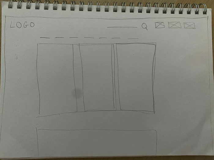
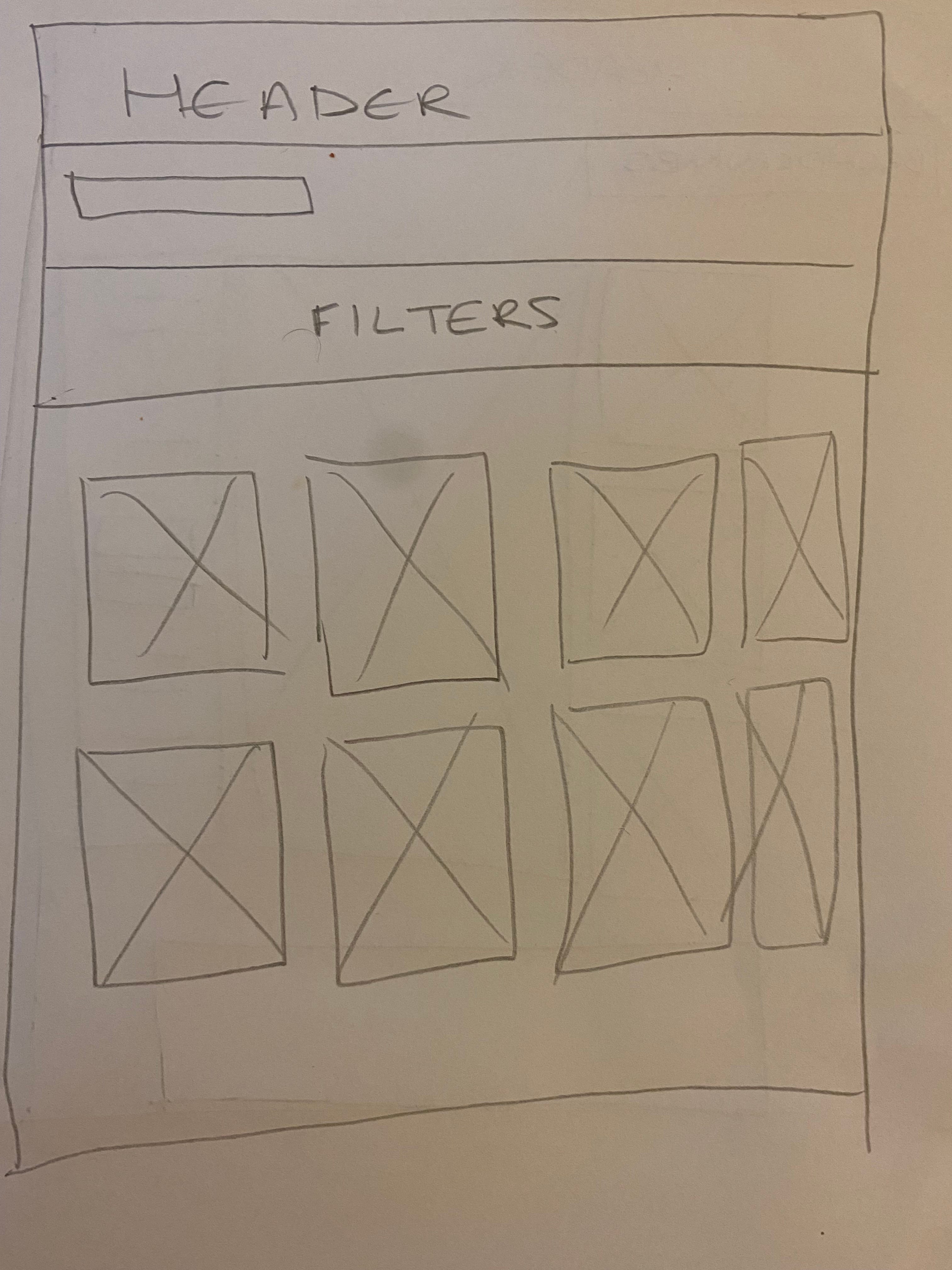
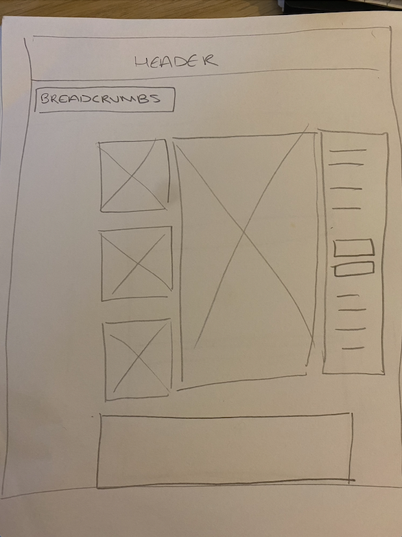
Following on from the sketches I created for my crazy 8s, I selected 3 of the top designs, and took elements from each one in order to come up with a layout I was happy with. It was important to keep the research results I had collected in mind in order to make sure that I was solving the initial problems and avoid creating new ones inadvertently.
Mid Fidelity Wireframes
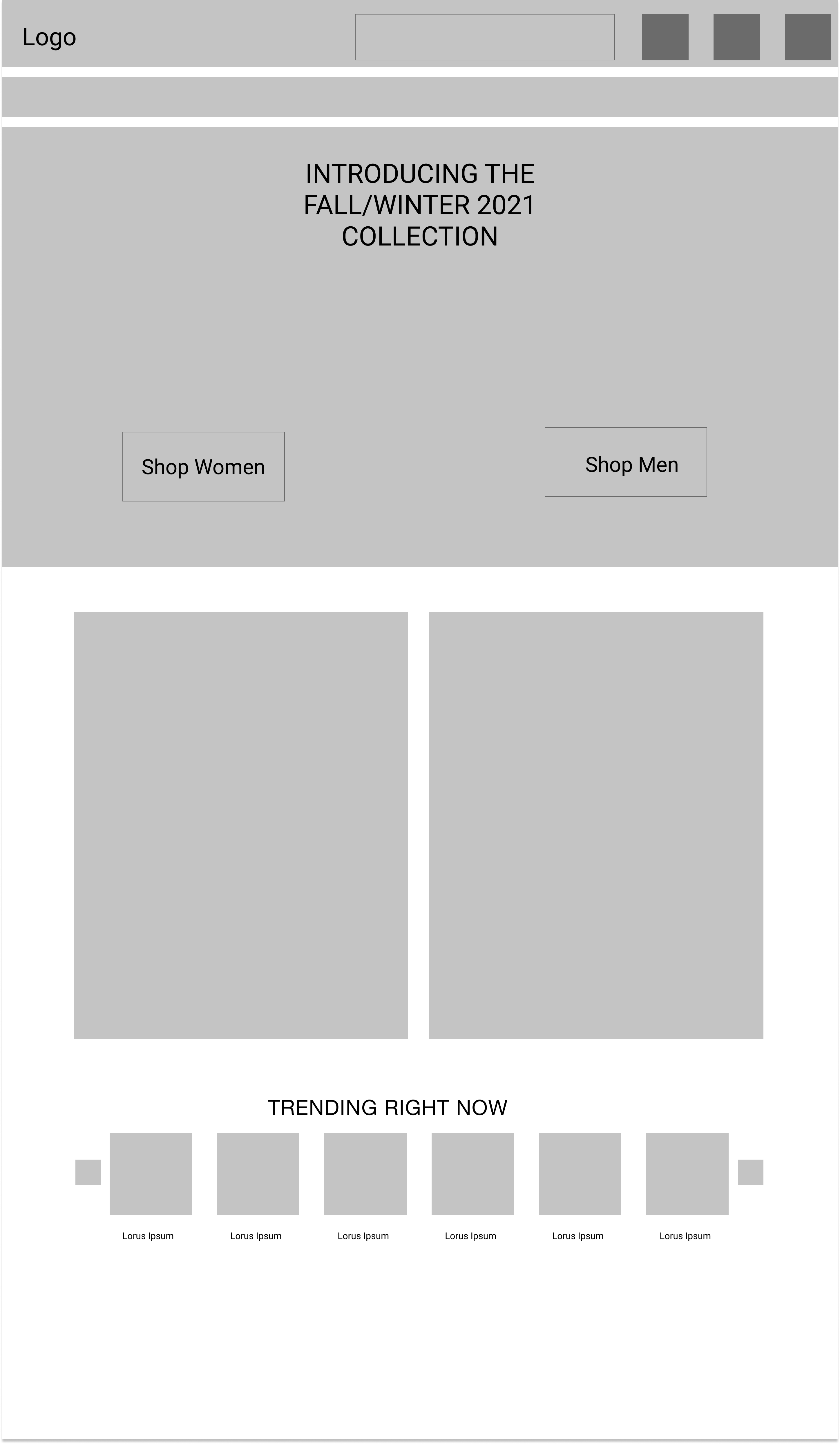
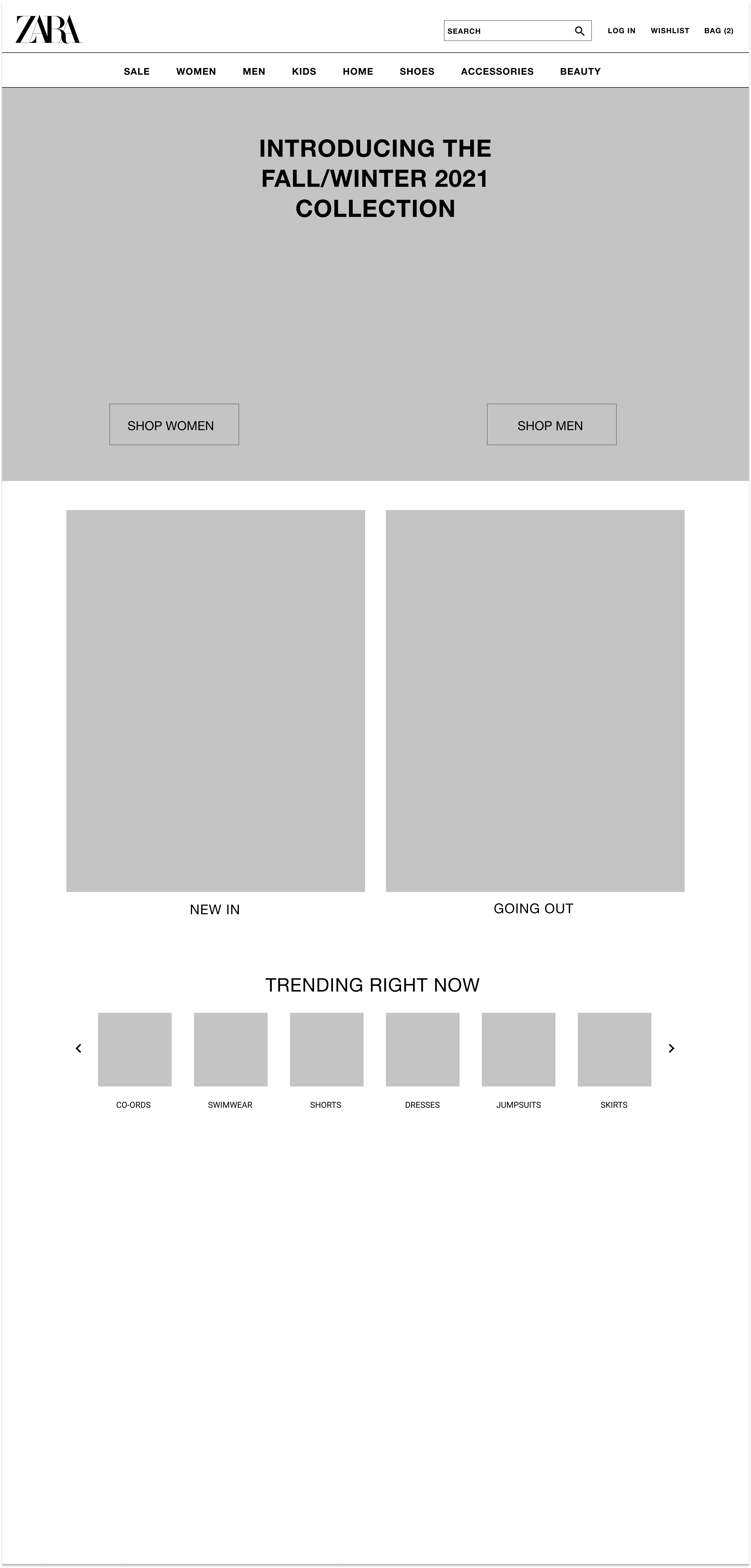
Moving on to the next stage, I began to develop my low fidelity sketches into mid fidelity wireframes using Figma. During this process, some design changes were made. In image 1, I drew squares in the header as placeholders to represent where the icons for ‘Log-in/Account’ ‘Wishlist’ and ‘Shopping Bag’ would be located.
I decided against icons and used text instead (as seen in image 2) with the reasoning that using text was more closely aligned with ZARA’s brand and aesthetic — which is very clean and minimal. However, when creating the wireframes for mobile, I quickly discovered that text would not fit in the header unless made very small, which would be unreadable, or I would have to remove the search bar from its position in the middle of the header. An alternative was to use icons for the mobile website only. I was able to find icons that matched ZARA’s aesthetic, and so included them in the design for the mobile header.
In order to keep my layout as consistent and accurate across the different screens I was working on, I used a baseline grid and followed IOS guidelines. Utilising grids and guidelines meant that I could make sure that any padding, margins and elements would be equally spaced out and well aligned.

High Fidelity Wireframes
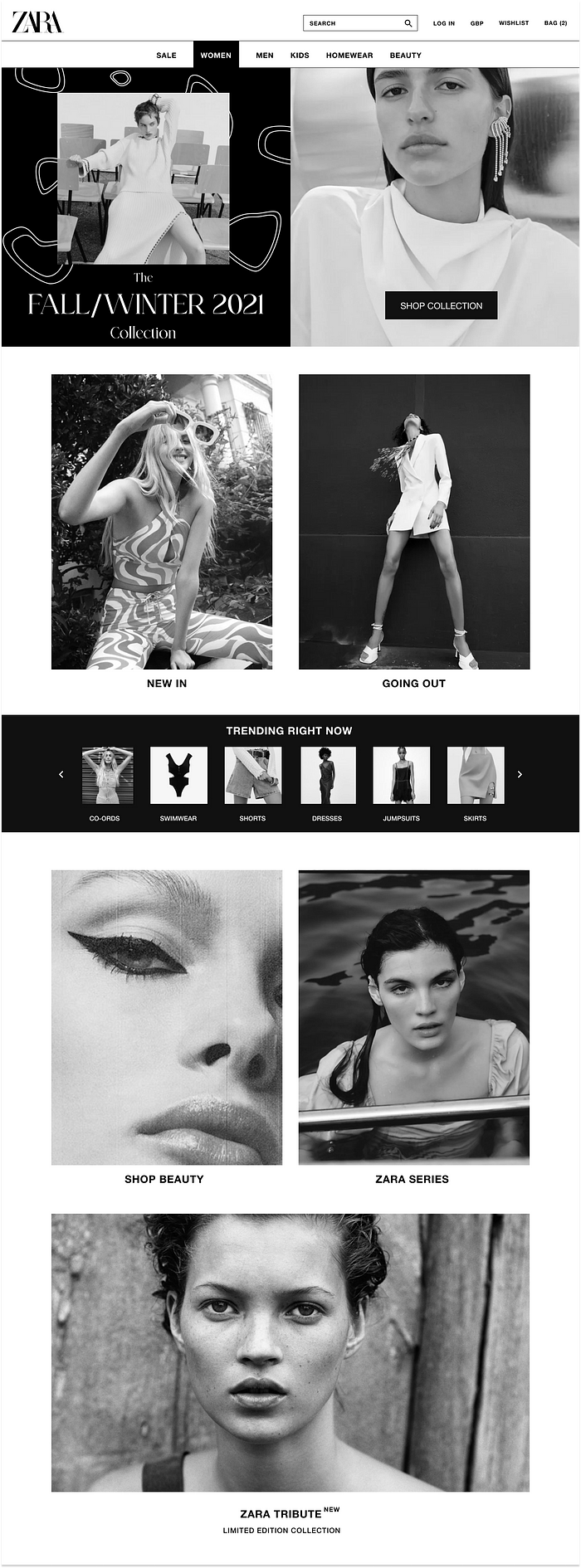
For the high fidelity wireframes, I replaced all of the placeholders with imagery, as seen below. Some changes made from the mid fidelity wireframes were adding currency to the header, to allow users to quickly change the currency they are shopping in if they choose to.


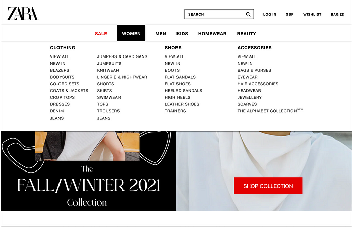
Final Deliverables: Homepage, Category Page and Product Page.




8. UI Phase
Design Fundamentals
The laws of UXUI played an important part in my designs, starting from the first sketches created for the Crazy 8’s stage of the process. The laws I focused on were:
Hick’s Law — This law states that users take longer to make a decision when there is more stimulus to choose from. To avoid prolonging the user journey by extending the time it takes to make decisions, I made sure to make sure the screen furniture being presented was minimal, and included only necessary information. This lowers the risk of potentially overwhelming users. The use of this law can be seen in the minimalist layout of each screen, and in the navigation bar.
Miller’s Law — Miller’s law states that the number of objects an average person can hold in working memory is about seven. This is also known as the Magical Number 7 (plus or minus 2). Organising content into smaller chunks is beneficial, as users are able to process, memorise and understand content more easily. To implement this law, I kept the items in the navigation to a minimum by listing the 6 main categories of ZARA’s products.
Law of Common Region — This law states that humans naturally perceive objects as organised patterns — so elements tend to be perceived into groups if they are located in the same region. This can be seen in different areas of my design such as in the header — the section containing the logo and search bar, login, shopping cart etc, are sectioned off inside an element with a black border. The navigation bar is grouped together in the same way. This can also be seen in the ‘Trending Items’ section on the homepage, where the law of common region was created by adding a black background behind this section to separate it from the rest of the page.
Aesthetic Usability Effect — Huruso and Koari’s study resulted in findings showing that users often perceive aesthetically pleasing designs as designs that are more usable and functional on the initial look. This means that users have a more positive emotional response towards any visual design, making them more tolerable of minor usability issues. This law ties into ZARA’s core values of ‘beauty’ and ‘clarity’. I took care to make use of ZARA’s brand colours of black and white, and implemented the colour white mostly through the use of white space, which can be seen throughout the designs of each screen. The overall effect is the feeling of luxury, high fashion, and a clean design.
Jakob’s Law — Jakob Nielson’s study concluded that users transfer their expectations from one familiar product to another, so they will expect them to work in the same or similar way. To execute this law, I included aspects from competitors such as ASOS when it came to the product pages, and sorting/filtering feature when shopping. This can be seen in images 3,4,5 and 6.
Typography
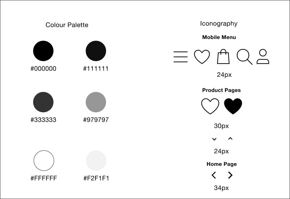
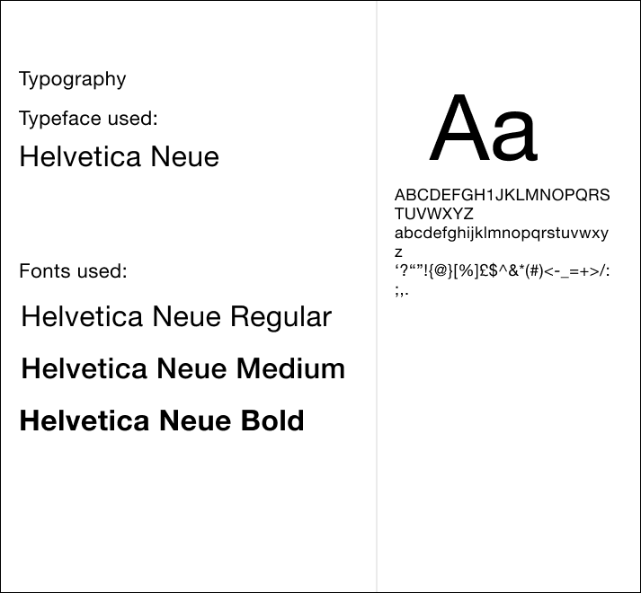
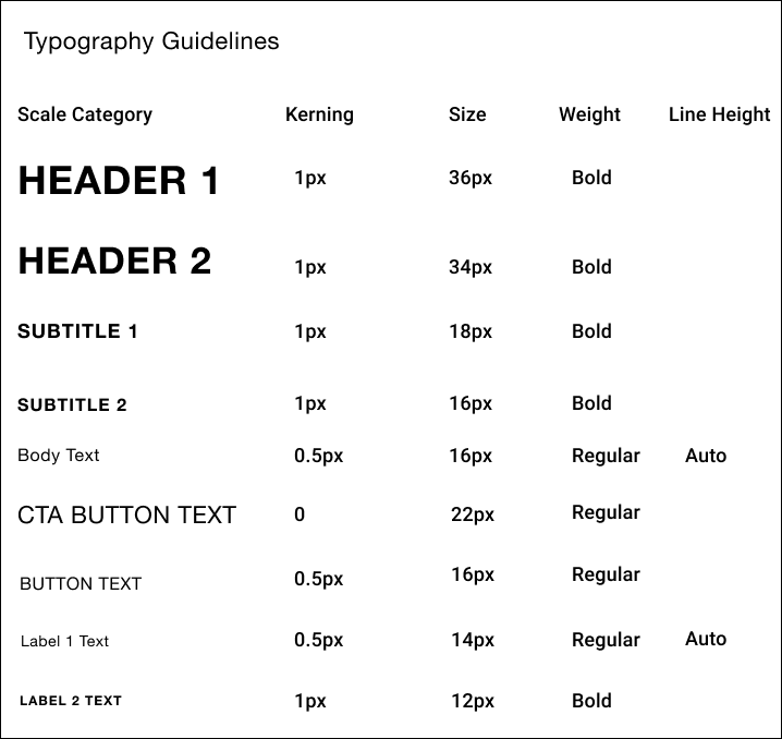
The typeface I decided to use was classed as sans-serif — Helvetica Neue, which is the original font used on the ZARA website. I decided to stick with this typeface due to its easy readability and variety in font styles. The different font styles meant I was able to use fonts such as bold and medium, and add kerning and line height to create hierarchy where needed on different sections of the designs. This is notable on the product page in the item description.
Style Guide
WCAG, Accessibility, and Inclusive Design
Throughout the design process, I was careful to keep accessibility guidelines in mind, as accessibility shouldn’t be an afterthought in design.
In terms of the colours used throughout the designs, it was straightforward in ensuring that there was a high enough contrast between colours so that they were accessible to users with visual impairments, due to the palette being black and white, with shades of grey in between.
I decided against the concept of using a carousel on the homepage, and instead used a hero image/banner as the main call to action. The reasoning behind this is that carousels often consist of images with the text being part of the image. This prevents users who browse with screen readers from being able to access much of the content, as screen readers are unable to pick up text in images. By designing my hero image/banner with a separate text element over on top, users with screen readers are able access the information. I also added a transparent white background behind the text to further separate it from the image, and make it clearer for those with visual impairments to see.
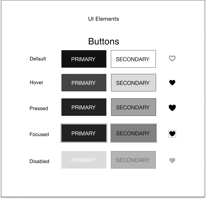
Font size was also an important factor, so I used font sizes of 14px and above on mobile, and 16px and above on desktop — with the exception of 12px which was used for small labels on mobile. As well as this, it was important to stay with the target sizes for call to actions (44px), so I tested my mobile screens using Figma Mirror to check that elements such as icons and buttons were large enough to tap on easily.
I used a Figma plugin called Contrast Checker on each frame to make sure that my screens met accessibility standards, as seen below.
9. Conclusion
Overall, I am happy with the final outcomes from my research and my final design solutions, as I feel I was able to learn how to design for the user rather than myself, whilst keeping the businesses needs in mind and without compromising on ZARA’s core values and brand identity.
I enjoyed working on this case study, as it allowed me to fully delve into the research side of things and focus on the UX in detail. I think some aspects of my research stages went well, such as my survey and initial background research — however I would have liked to have been able to spend more time on card sorting with more participants so I could work more on the information architecture. Interviews would have also helped me to gain more qualitative data compared to a survey, as I would have been able to see things that qualitative data doesn’t reveal, but due to the time constraints I had, that wasn’t possible for this project. However it is a research method I would like to use in my next case study.
If I had more time or the ability to launch this project and collect user feedback to support my hypothesis, I would like to use A/B Testing and Data/Web analytics, as seeing the user’s journey, where users fell off, and how much converted are great ways of realising and confirming what pain points may exist and are causing a problem for users.
10. References
- https://www.statista.com/study/38340/ecommerce-report-fashion/
- https://commonthreadco.com/blogs/coachs-corner/fashion-ecommerce-industry-trend
- https://www.vertical-leap.uk/blog/three-ecommerce-brands-hyper-personalisation/
- https://www.bigcommerce.com/articles/ecommerce/ecommerce-trends/#14-ecommerce-trends-leading-the-way
- https://www.intechnologysmartcities.com/blog/5-reasons-behind-the-decline-of-the-uk-high-street/
- https://www.theguardian.com/business/2021/mar/14/great-britain-high-streets-lost-more-than-17500-chain-stores-in-2020-covid
- https://sustainablewebdesign.org/
- https://www.inditex.com/about-us/inditex-around-the-world#continent/000
- https://www.owler.com/company/zara
